Detecting seasonality 
Sign up to the DEA Sandbox to run this notebook interactively from a browser
Compatibility: Notebook currently compatible with both the
NCIandDEA SandboxenvironmentsProducts used: DEA Waterbodies
Description
We often want to analyse a time series to detect long-term trends or events. Time series that span multiple months will have seasonal effects: for example, northern Australia is much wetter in summer due to monsoons. This seasonality may impact our ability to detect the trends or events we are interested in. This notebook provides a few different ways to detect seasonality and check whether deseasonalised data have been correctly deseasonalised. We will look at a seasonal waterbody time series as an example.
Getting started
To run this analysis, run all the cells in the notebook, starting with the “Load packages” cell.
Load packages
Load key Python packages and supporting functions for the analysis.
[1]:
%matplotlib inline

import calendar
import matplotlib.pyplot as plt
import matplotlib.cm
import numpy as np
import pandas as pd
import scipy.stats
import statsmodels.tsa.seasonal as sm_seasonal
import statsmodels.tsa.stattools as tsa_stats
import shapely

import sys
sys.path.insert(1, '../Tools/')
from dea_tools.waterbodies import get_waterbody, get_time_series
Analysis parameters
Choose a waterbody to analyse:
[2]:
geohash = "r1twfjubj_v2" # Lake Tyrrell
Load the waterbody time series
[3]:
ts = get_time_series(geohash)
[4]:
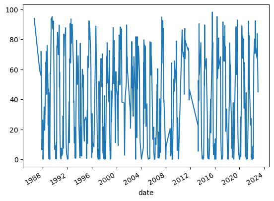
ts.pc_wet.plot()
[4]:
<AxesSubplot: xlabel='date'>
Then resample the time series to weekly and interpolate. Having a consistent gap between observations makes analysis of time series much easier. In particular, this notebook won’t work without an evenly spaced time series.
Here, we interpolate with pandas since our time series is in a pandas.DataFrame; xarray has a similar interpolate method that can interpolate over xarray.DataArray.
[5]:
ts = ts.resample("1W").mean().interpolate(method="time").pc_wet
[6]:
assert not ts.isnull().any()
Deseasonalise it for comparison.
[7]:
decomposition = sm_seasonal.seasonal_decompose(ts + 1, model="multiplicative")
[8]:
ts_deseasonal = decomposition.trend + decomposition.resid - 1
[9]:
ts_deseasonal = ts_deseasonal[pd.notnull(ts_deseasonal)]
Autocorrelation
The autocorrelation function (ACF) shows how correlated lagged data are. Seasonal data are highly correlated with a lag of one year. Let’s compute the ACF for both our waterbody time series and the deseasonalised waterbody time series.
[10]:
acf = tsa_stats.acf(ts, nlags=52 * 3, fft=True)
acf_deseasonal = tsa_stats.acf(ts_deseasonal, nlags=52 * 3, fft=True)
[11]:
plt.plot(acf, label="seasonal")
plt.plot(acf_deseasonal, label="deseasonalised")
plt.xlabel("Lag (weeks)")
plt.ylabel("ACF")
for i in range(1, 3):
    plt.axvline(52 * i, c="grey", linestyle="--")
plt.legend();
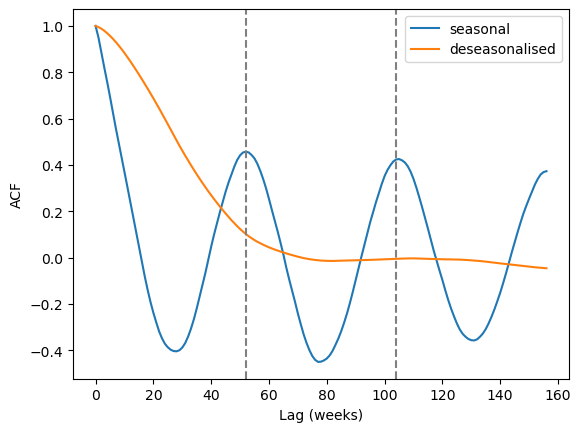
The seasonal peaks are clearly visible at the 52 and 104 week marks for the seasonal data, while no such peaks can be seen for the deseasonalised data.
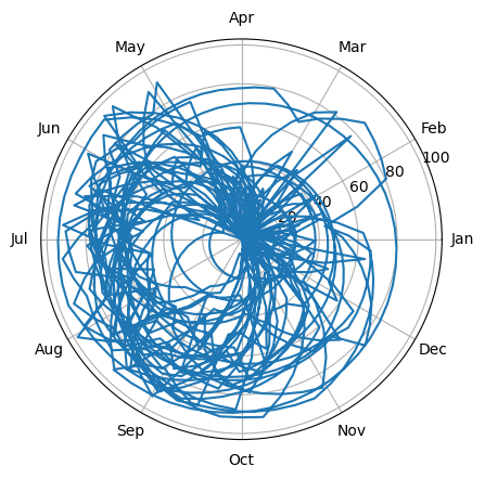
Angular visualisation
A date can be thought of as an angle (the angle of the Earth’s position around the sun). In this way we can project the time series into polar coordinates. Non-seasonal data will circle around the origin and be a perfect circle on average; seasonal data will be offset from the origin. Long-term trends may show as spirals.
[12]:
time_angle = 2 * np.pi * ts.index.dayofyear / 365.25
[13]:
ax = plt.subplot(projection="polar")
ax.plot(time_angle, ts)
ax.set_xticks(np.linspace(0, 2 * np.pi, 12, endpoint=False))
ax.set_xticklabels(list(calendar.month_abbr)[1:]);
We can also bin the data by angle to make the circle easier to see.
[14]:
n_bins = 52
binned_mean = scipy.stats.binned_statistic(time_angle, ts, bins=n_bins)
binned_stdev = scipy.stats.binned_statistic(
    time_angle, ts, bins=n_bins, statistic="std"
)
[15]:
ax = plt.subplot(projection="polar")
mean = np.resize(binned_mean.statistic, n_bins + 1)
stdev = np.resize(binned_stdev.statistic, n_bins + 1)
# np.resize is different to ndarray.resize!
ax.plot(binned_mean.bin_edges, mean)
ax.fill_between(
    binned_mean.bin_edges, np.clip(mean - stdev, 0, None), mean + stdev, alpha=0.2
)

# Get the centre of the circle so we can plot that too:
proj = ax.transData.transform(np.stack([binned_mean.bin_edges, mean]).T)
polygon = shapely.geometry.Polygon(proj)
reproj = ax.transData.inverted().transform((polygon.centroid.x, polygon.centroid.y))
plt.scatter(*reproj, c="C0")

ax.set_xticks(np.linspace(0, 2 * np.pi, 12, endpoint=False))
ax.set_xticklabels(list(calendar.month_abbr)[1:]);
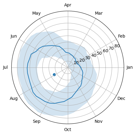
This waterbody is wetter from May to September and drier from November to April. The centre of the circle is clearly offset. Let’s compare to the deseasonalised:
[16]:
time_angle_deseasonal = 2 * np.pi * ts_deseasonal.index.dayofyear / 365.25
[17]:
binned_mean_deseasonal = scipy.stats.binned_statistic(
    time_angle_deseasonal, ts_deseasonal, bins=n_bins
)
binned_stdev_deseasonal = scipy.stats.binned_statistic(
    time_angle_deseasonal, ts_deseasonal, bins=n_bins, statistic="std"
)

ax = plt.subplot(projection="polar")
ax.plot(binned_mean.bin_edges, mean, label="seasonal")
ax.fill_between(
    binned_mean.bin_edges, np.clip(mean - stdev, 0, None), mean + stdev, alpha=0.2
)
plt.scatter(*reproj, c="C0")

mean_deseasonal = np.resize(binned_mean_deseasonal.statistic, n_bins + 1)
stdev_deseasonal = np.resize(binned_stdev_deseasonal.statistic, n_bins + 1)
# np.resize is different to ndarray.resize!
ax.plot(binned_mean_deseasonal.bin_edges, mean_deseasonal, label="deseasonalised")
ax.fill_between(
    binned_mean_deseasonal.bin_edges,
    np.clip(mean_deseasonal - stdev_deseasonal, 0, None),
    mean_deseasonal + stdev_deseasonal,
    alpha=0.2,
)

proj_deseasonal = ax.transData.transform(
    np.stack([binned_mean_deseasonal.bin_edges, mean_deseasonal]).T
)
polygon_deseasonal = shapely.geometry.Polygon(proj_deseasonal)
reproj_deseasonal = ax.transData.inverted().transform(
    (polygon_deseasonal.centroid.x, polygon_deseasonal.centroid.y)
)
plt.scatter(*reproj_deseasonal, c="C1")

ax.set_xticks(np.linspace(0, 2 * np.pi, 12, endpoint=False))
ax.set_xticklabels(list(calendar.month_abbr)[1:])

ax.legend(bbox_to_anchor=(0, 1));
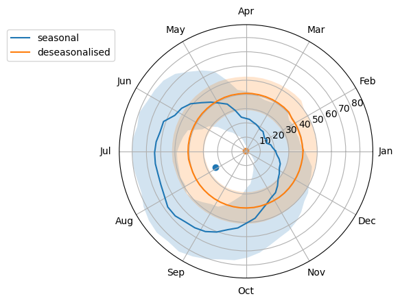
The deaseasonalised data are much more circular and the centre is very close to the origin.
We can convert this into a numerical measure to help determine how seasonal the data are (which would be useful for analysis en masse). One way to do this is to compute the Polsby-Popper score, which is the ratio of the area to the squared perimeter, multiplied by \(4\pi\). This is a measure of compactness and a circle is a maximally compact shape.
[18]:
pp = 4 * np.pi * polygon.area / polygon.exterior.length ** 2
pp_deseasonal = (
    4 * np.pi * polygon_deseasonal.area / polygon_deseasonal.exterior.length ** 2
)
[19]:
print("Seasonal Polsby-Popper:", round(pp, 2))
print("Deseasonalised Polsby-Popper:", round(pp_deseasonal, 2))
Seasonal Polsby-Popper: 0.93
Deseasonalised Polsby-Popper: 0.97
The closer we are to 1, the more circular the data.
Circularity alone doesn’t tell us that we have non-seasonal data. The circle also needs to be centred. We can measure the distance from the origin:
[20]:
print("Seasonal offset:", reproj[1])
print("Deseasonalised offset:", reproj_deseasonal[1])
Seasonal offset: 24.341655654859444
Deseasonalised offset: 0.5909036595530159
The closer we are to zero, the less offset from the origin our data are.
Seasonal subseries plot
A seasonal subseries plot groups data by period (in this case there are 12 months in the year, so the period is 12), and then plots each group. This can help detect both seasonality and change in seasonality over time.
[21]:
plt.figure(figsize=(2 * 6.4, 4.8))
titles = ["seasonal", "deseasonalised"]
monthly_means = [[], []]
for i, ts_ in enumerate([ts, ts_deseasonal]):
    plt.subplot(1, 2, i + 1)
    colours = matplotlib.cm.rainbow(np.linspace(0, 1, 12))
    for month, t in ts_.groupby(ts_.index.month):
        plt.plot(
            month + np.linspace(0, 1, len(t)),
            t.rolling(10).mean(),
            c=colours[month - 1],
        )
        plt.plot([month, month + 1], [t.mean()] * 2, c="k")
        plt.plot(
            [month + 0.5] * 2,
            [t.mean() - t.std(), t.mean() + t.std()],
            c="k",
            alpha=0.5,
        )
        monthly_means[i].append(t.mean())
    plt.xlabel("Month")
    plt.xticks(np.arange(1.5, 13.5), calendar.month_abbr[1:])
    plt.ylabel("Percentage wet")
    plt.title(titles[i])
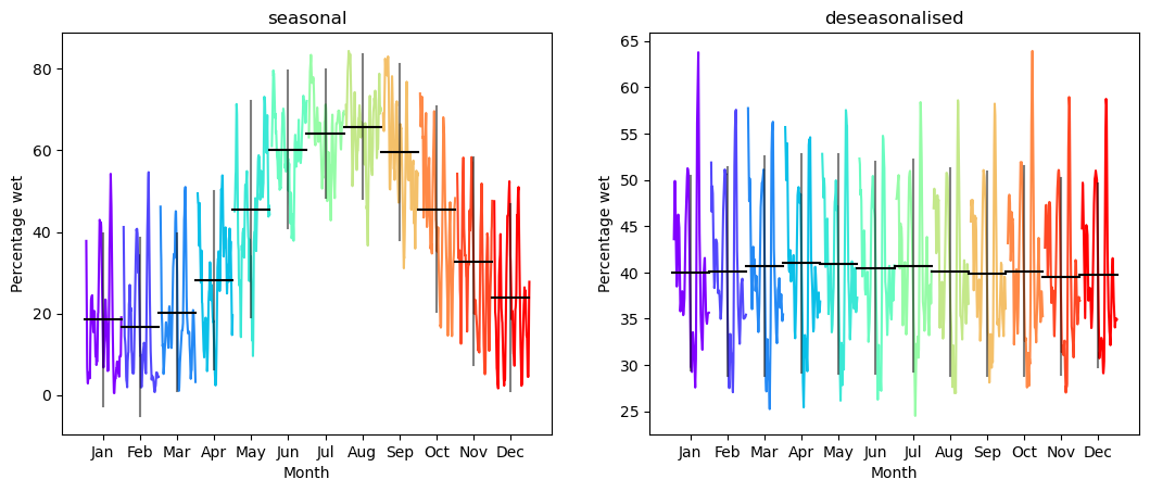
The seasonal plot again shows very clear maxima during winter and minima during summer. The deseasonalised plot has no such pattern, and the differences between monthly means are within standard error.
We can also aggregate this plot into a single number representing seasonality. There are many ways to do this — any measure of how deviant the means are from a horizontal line would work, for example. One such measure would be the average deviation from the mean:
[22]:
monthly_means = np.array(monthly_means)
[23]:
mad = abs(monthly_means - monthly_means.mean(axis=1, keepdims=True)).mean(axis=1)
[24]:
print("Seasonal mean average deviation:", mad[0].round(2))
print("Deseasonalised mean average deviation:", mad[1].round(2))
Seasonal mean average deviation: 16.71
Deseasonalised mean average deviation: 0.41
The closer to zero, the less seasonal the data are.
Additional information
License: The code in this notebook is licensed under the Apache License, Version 2.0. Digital Earth Australia data is licensed under the Creative Commons by Attribution 4.0 license.
Contact: If you need assistance, please post a question on the Open Data Cube Slack channel or on the GIS Stack Exchange using the open-data-cube tag (you can view previously asked questions here). If you would like to report an issue with this notebook, you can file one on
GitHub.
Last modified: December 2023
Tags
Tags: DEA Waterbodies, time series, seasonality