Monitoring change through time using satellite imagery filmstrip plots 
Sign up to the DEA Sandbox to run this notebook interactively from a browser
Compatibility: Notebook currently compatible with both the
DEA SandboxandNCIenvironmentsProducts used: ga_ls5t_ard_3, ga_ls7e_ard_3, ga_ls8c_ard_3
Background
Understanding how natural and human landscapes have changed through time can provide vital information about the health of local ecosystems and development of the built environment. For example, data on changes in the distribution of vegetation in the landscape can be used to monitor the impact of deforestation, or track the recovery of forests after habitat restoration or extreme natural events (e.g. bushfires). Tracking changes within urban areas can be used monitor the growth of infrastructure such as ports and transport networks, while data on coastal changes can be vital for predicting and managing the impacts of coastal erosion or the loss of coastal wetlands (e.g. mangroves).
Although these examples of change can be tracked using direct on-the-ground monitoring (e.g. vegetation surveys), it can be extremely challenging and expensive to obtain a comprehensive understanding of these processes at a broader landscape scale. For many applications, it can also be extremely useful to obtain a record of the history of a location undergoing change. This typically requires historical monitoring data which is unlikely to be available for all but the most intensively monitored locations.
Digital Earth Australia use case
More than 30 years of satellite imagery from the NASA/USGS Landsat program is freely available for Australia, making this a powerful resource for monitoring natural and human-driven change across the Australian continent. Because these satellites image every location over Australia regularly (approximately once every 16 days), they provide an unparalleled archive of how many of Australia’s landscapes have changed through time.
Analysing change from individual satellite images can be made difficult by the presence of clouds, cloud shadow, sunglint over water, and dynamic processes like changing tides along the coastline. By combining individual noisy images into cleaner, cloud-free “summary” images that cover a longer time period (e.g. one or multiple years), we can obtain a clear, consistent view of the Australian environment that can be compared to reveal changes in the landscape over time.
Description
In this example, Digital Earth Australia Landsat data is extracted for a given time range and location, and combined using the geometric median (“geomedian”) statistic to reveal the median or ‘typical’ appearance of the landscape for a series of time periods (for more information about geomedians, see the Geomedian composites notebook).
For coastal applications, the analysis can be customised to select only satellite images obtained during a specific tidal range (e.g. low, average or high tide).
The results for each time period are combined into a ‘filmstrip’ plot which visualises how the landscape has changed in appearance across time, with a ‘change heatmap’ panel highlighting potential areas of greatest change:
Getting started
To run this analysis, run all the cells in the notebook, starting with the “Load packages” cell.
Load packages
Import Python packages used for the analysis.
[1]:
%matplotlib inline

from datacube.utils.cog import write_cog

import sys
sys.path.insert(1, '../Tools/')
from dea_tools.app import changefilmstrips
Analysis parameters
The following cell sets important required parameters for the analysis:
output_name: A name that will be used to name the output filmstrip plot filetime_range: The date range to analyse (e.g.time_range = ('1988-01-01', '2017-12-31'))time_step: This parameter allows us to choose the length of the time periods we want to compare (e.g.time_step = {'years': 5}will generate one filmstrip plot for every five years of data in the dataset;time_step = {'months': 18}will generate one plot for each 18 month period etc. Time periods are counted from the first value given intime_range.
Optional parameters:
tide_range: This parameter allows you to generate filmstrip plots based on specific ocean tide conditions. This can be valuable for analysing change consistently along the coast. For example,tide_range = (0.0, 0.2)will select only satellite images acquired at the lowest 20% of tides;tide_range = (0.8, 1.0)will select images from the highest 20% of tides. The default istide_range = (0.0, 1.0)which will select all images regardless of tide.resolution: The spatial resolution to load data. The default isresolution = (-30, 30), which will load data at 30 m pixel resolution. Increasing this (e.g. toresolution = (-100, 100)) can be useful for loading large spatial extents.max_cloud: This parameter allows you to exclude satellite images with excessive cloud. The default is50, which will keep all images with less than 50% cloud.ls7_slc_off: Whether to include data from after the Landsat 7 SLC failure (i.e. SLC-off). Defaults toFalse, which removes all Landsat 7 observations after May 31 2003. Setting this toTruewill result in extra data, but can also introduce horizontal striping in the output filmstrip plots.
If running the notebook for the first time, keep the default settings below. This will demonstrate how the analysis works and provide meaningful results.
[2]:
# Required parameters
output_name = 'example'
time_range = ('1988-01-01', '2017-12-31')
time_step = {'years': 5}

# Optional parameters
tide_range = (0.0, 1.0)
resolution = (-30, 30)
max_cloud = 80
ls7_slc_off = False
Select location and generate filmstrips
Run the following cell to start the analysis. This will plot an interactive map that is used to select the area to load satellite data for.
Select the Draw a rectangle or Draw a polygon tool on the left of the map, and draw a shape around the area you are interested in.
For the first run, try drawing a square around Sydney Airport and Port Botany to see an example of change driven by urban and coastal development.
When you are ready, press the green done button on the top right of the map. This will start loading the data, and then generate a filmstrips plot.
Depending on the size of the area you select, this step can take several minutes to complete. To keep load times reasonable, select an area smaller than 200 square kilometers in size (this limit can be overuled by supplying the
size_limitparameter in therun_filmstrip_appfunction below).
Once the analysis reaches the
Generating geomedian compositesstep, you can check the status of the data load by clicking the Dashboard link under Client below.
[ ]:
geomedians, heatmap = changefilmstrips.run_filmstrip_app(
    output_name, time_range, time_step, tide_range, resolution, max_cloud,
    ls7_slc_off)
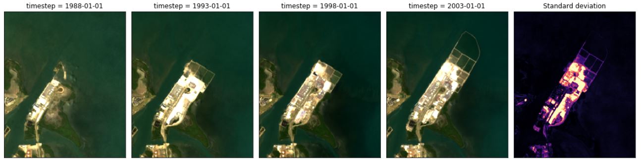
Using filmstrip plots to identify change
The filmstrip plot above contains several colour imagery panels that summarise the median or ‘typical’ appearance of the landscape for the time periods defined using time_range and time_step. If you ran the analysis over the Sydney Airport and Port Botany area, inspect each of the imagery plots. Some key examples of change that appear include:
The 1994 construction of Sydney Airport’s third runway in the second panel (covering the five year period between 1993 and 1998)
The 2011 expansion of Port Botany visible as construction in the fifth panel, and completed by the sixth panel
Increasing commercial and industrial development (e.g. large white roofs) in the suburb of Mascot north of Port Botany
Change heatmap
To make it easier to identify areas that have changed between each filmstrip panel, the final panel provides a “change heatmap”. This highlights pixels whose values vary greatly between the panels in the filmstrip plot. Bright colours indicate pixels that have changed; dark colours indicate pixels that have remained relatively similar across time.
Compare the “change heatmap” panel against the colour imagery panels. You should be able to clearly see Sydney Airport’s third runway and the Port Botany port expansion highlighted in bright colours.
Technical info: The “change heatmap” is calculated by first taking a log transform of the imagery data to emphasize dark pixels, then calculating standard deviation across all of the filmstrip panels to reveal pixels that changed over time.
Downloading filmstrip plot
The high resolution version of the filmstrip plot generated above will be saved to the same location you are running this notebook from (e.g. typically Real_world_examples). In JupyterLab, use the file browser to locate the image file with a name in the following format:
filmstrip_{output_name}_{date_string}_{time_step}.png
If you are using the DEA Sandbox, you can download the image to your PC by right clicking on the image file and selecting Download.
Export GeoTIFF data
It can be useful to export each of the filmstrip panels generated above as GeoTIFF raster files so that they can be loaded into a Geographic Information System (GIS) software for further analysis. Because the filmstrip panels were generated using the “geomedian” statistic that preserves relationships between spectral bands, the resulting data can be validly analysed in the same way as we would analyse an individual satellite image.
To export the GeoTIFFs, run the following cell then right click on the files in the JupyterLab file browser and select Download.
[4]:
# Export filmstrip panels
for i, ds in geomedians.groupby('timestep'):
    print(f'Exporting {i} data')
    write_cog(geo_im=ds.to_array(),
              fname=f'geotiff_{output_name}_{i}.tif',
              overwrite=True)

# Export change heatmap
print('Exporting change heatmap')
write_cog(geo_im=heatmap,
          fname=f'geotiff_{output_name}_heatmap.tif',
          overwrite=True)
Exporting 1988-01-01 data
Exporting 1993-01-01 data
Exporting 1998-01-01 data
Exporting 2003-01-01 data
Exporting 2008-01-01 data
Exporting 2013-01-01 data
Exporting change heatmap
[4]:
PosixPath('geotiff_example_heatmap.tif')
Next steps
When you are done, return to the Analysis parameters section, modify some values and rerun the analysis. For example, you could try:
Modify
time_rangeto look at a specific time period of interest (e.g.time_range = ('1990-01-01', '2000-01-01').Setting a shorter
time_step(e.g.time_step = {'years': 2}) for a more detailed look at how the landscape has changed over shorter time periods.Inspecting change along the coastline after controlling for tide using the
tide_rangeparameter (e.g.tide_range = (0.0, 0.3)to look at the landscape during the lowest 30% of tides). For the best results, test this out in an area with high tides such as Roebuck Bay in West Australia’s Kimberley region.
Additional information
License: The code in this notebook is licensed under the Apache License, Version 2.0. Digital Earth Australia data is licensed under the Creative Commons by Attribution 4.0 license.
Contact: If you need assistance, please post a question on the Open Data Cube Slack channel or on the GIS Stack Exchange using the open-data-cube tag (you can view previously asked questions here). If you would like to report an issue with this notebook, you can file one on
GitHub.
Last modified: December 2023
Compatible datacube version:
[5]:
import datacube
print(datacube.__version__)
1.8.6
Tags
Tags: NCI compatible, sandbox compatible, landsat 5, landsat 7, landsat 8, load_ard, mostcommon_crs, tidal_tag, rgb, image compositing, geomedian, filmstrip plot, change monitoring, real world, widgets, interactive, no_testing