Visualising coastal turbidity with Sentinel-2 
Sign up to the DEA Sandbox to run this notebook interactively from a browser
Compatibility: Notebook currently compatible with the
DEA SandboxenvironmentProducts used: ga_s2am_ard_3, ga_s2bm_ard_3
Background
Turbidity refers to the degree of clarity or the presence of suspended particles in a liquid. In the context of water, it is an optical property that quantifies the amount of light scattered by substances within the water sample when illuminated. Increased turbidity is indicative of a higher intensity of scattered light, which can be caused by various materials such as clay, silt, microscopic organisms, algae, dissolved organic compounds, and other fine inorganic and organic matter. Elevated levels of particulate matter often represent increases in pollutants which can have detrimental effects upon ecosystems. Read more here.
Traditional survey methods for measuring turbidity, such as collecting water samples and using Secci disks, can be time-consuming, costly, and limited in terms of spatial coverage and frequency of measurements. These methods require manual data collection, laboratory analysis, and on-site deployments. In contrast, remote sensing through satellites offers a cost-effective and efficient alternative. Satellite remote sensing provides wide coverage and frequent data acquisition, allowing for a comprehensive assessment of turbidity over large areas. One widely used remote sensing index for turbidity estimation is the Normalised Difference Turbidity Index (NDTI). The NDTI quantifies the difference in reflectance between specific spectral bands, which correlates with suspended sediment and turbidity levels. It’s important to note that NDTI values do not directly represent defined turbidity values in units such as NTU (Nephelometric Turbidity Units). However, by calibrating the NDTI with in-situ turbidity data recorded concurrently during image capture, it becomes possible to establish a correlation between NDTI values and actual turbidity measurements. This calibration enables NTU estimation, providing valuable insights into water quality. The NDTI equation is defined below:
\begin{equation} NDTI = \frac{(Red - Green)}{(Red + Green)} \end{equation}
Description
In this example, we create a time series animation depicting a turbidity plume at the Murray Mouth and the surrounding coastline. The animations contrast Sentinel-2 imagery taken from early-2022 to mid-2023; this coincides with ‘the flood of a generation’, peaking in mid-January 2023, leading to a stark decline in water quality within the vicinity. This example demonstrates how to:
Load Sentinel-2 data
Compute turbidity and water indices (NDTI, NDWI)
Mask pixels which contain land and cloud
Create time series animations
Visualise changes in turbidity throughout a floodwater discharge event
Getting started
To run this analysis, run all the cells in the notebook, starting with the “Load packages” cell.
After finishing the analysis, return to the “Analysis parameters” cell, modify some values (e.g. choose a different location or time period to analyse) and re-run the analysis. There are additional instructions on modifying the notebook at the end.
Load key Python packages and supporting functions for the analysis.
[1]:
%matplotlib inline
from IPython.core.display import Video
from IPython.display import Image
import datacube
import matplotlib.pyplot as plt
from datacube.utils import masking
import sys
sys.path.insert(1, "../Tools/")
from dea_tools.plotting import rgb, display_map
from dea_tools.bandindices import calculate_indices
from dea_tools.dask import create_local_dask_cluster
from dea_tools.datahandling import load_ard
from dea_tools.plotting import rgb, xr_animation
# Connect to dask
client = create_local_dask_cluster(return_client=True)
Client
Client-b220affd-0e6e-11ee-8221-f20df12de3eb
| Connection method: Cluster object | Cluster type: distributed.LocalCluster |
| Dashboard: /user/robbi.bishoptaylor@ga.gov.au/proxy/8787/status |
Cluster Info
LocalCluster
b06f97de
| Dashboard: /user/robbi.bishoptaylor@ga.gov.au/proxy/8787/status | Workers: 1 |
| Total threads: 2 | Total memory: 12.21 GiB |
| Status: running | Using processes: True |
Scheduler Info
Scheduler
Scheduler-f25e5dbe-cd17-47bc-881c-04369d14b9af
| Comm: tcp://127.0.0.1:37887 | Workers: 1 |
| Dashboard: /user/robbi.bishoptaylor@ga.gov.au/proxy/8787/status | Total threads: 2 |
| Started: Just now | Total memory: 12.21 GiB |
Workers
Worker: 0
| Comm: tcp://127.0.0.1:35563 | Total threads: 2 |
| Dashboard: /user/robbi.bishoptaylor@ga.gov.au/proxy/37131/status | Memory: 12.21 GiB |
| Nanny: tcp://127.0.0.1:40299 | |
| Local directory: /tmp/dask-scratch-space/worker-h80r76yw | |
Activate the datacube database, which provides functionality for loading and displaying stored Earth observation data.
[2]:
dc = datacube.Datacube(app='Turbidity_animated_timeseries')
The selected latitude and longitude will be displayed as a red box on the map below the next cell. This map can be used to find coordinates of other places, simply scroll and click on any point on the map to display the latitude and longitude of that location.
[3]:
lat_range = (-35.51, -35.73)
lon_range = (138.506, 139.028)
display_map(x=lon_range, y=lat_range)
[3]:
Load Sentinel-2 data
The first step in this analysis is to load in Sentinel-2 optical data for the lat_range, lon_range and the desired time range. Note that only the necessary bands have been added to reduce load times. The load_ard function is used here to load data that has undergone geometric correction and surface reflection correction, making it ready for analysis. More information on Digital Earth Australia’s ARD and the Open Data Cube here.
Note: This may take some time to load your selected data; click on the Dask Client “Dashboard” link above to see how it is progressing.
[4]:
# Load satellite data from datacube
query = {
"y": lat_range,
"x": lon_range,
"time": ("2022-02-21", "2023-06-01"),
"measurements": [
"nbart_red",
"nbart_green",
"nbart_blue",
"nbart_nir_1",
"oa_s2cloudless_prob",
],
"output_crs": "EPSG:3577",
"resolution": (-60, 60),
"resampling": "average",
}
# Load available data from both Sentinel-2 satellites
ds = load_ard(
dc=dc,
products=["ga_s2am_ard_3", "ga_s2bm_ard_3"],
dask_chunks={"time": 1},
min_gooddata=0.85,
mask_pixel_quality=False,
group_by="solar_day",
**query
)
# Load selected data into memory using Dask
ds.load()
Finding datasets
ga_s2am_ard_3
ga_s2bm_ard_3
Counting good quality pixels for each time step using fmask
Filtering to 29 out of 185 time steps with at least 85.0% good quality pixels
Returning 29 time steps as a dask array
[4]:
<xarray.Dataset>
Dimensions: (time: 29, y: 449, x: 809)
Coordinates:
* time (time) datetime64[ns] 2022-03-12T00:47:04.634097 ......
* y (y) float64 -3.894e+06 -3.894e+06 ... -3.921e+06
* x (x) float64 5.878e+05 5.879e+05 ... 6.363e+05 6.363e+05
spatial_ref int32 3577
Data variables:
nbart_red (time, y, x) int16 1355 1325 982 940 ... 55 49 60 59
nbart_green (time, y, x) int16 996 955 725 716 ... 171 157 169 164
nbart_blue (time, y, x) int16 722 716 556 542 ... 225 239 214 227
nbart_nir_1 (time, y, x) int16 2410 2264 2116 1913 ... 35 29 35 34
oa_s2cloudless_prob (time, y, x) float64 0.06223 0.03058 ... 0.1506 0.1395
Attributes:
crs: EPSG:3577
grid_mapping: spatial_refExamine the data by printing it in the next cell. The Dimensions argument revels the number of time steps in the data set, as well as the number of pixels in the x (longitude) and y (latitude) dimensions.
[5]:
ds
[5]:
<xarray.Dataset>
Dimensions: (time: 29, y: 449, x: 809)
Coordinates:
* time (time) datetime64[ns] 2022-03-12T00:47:04.634097 ......
* y (y) float64 -3.894e+06 -3.894e+06 ... -3.921e+06
* x (x) float64 5.878e+05 5.879e+05 ... 6.363e+05 6.363e+05
spatial_ref int32 3577
Data variables:
nbart_red (time, y, x) int16 1355 1325 982 940 ... 55 49 60 59
nbart_green (time, y, x) int16 996 955 725 716 ... 171 157 169 164
nbart_blue (time, y, x) int16 722 716 556 542 ... 225 239 214 227
nbart_nir_1 (time, y, x) int16 2410 2264 2116 1913 ... 35 29 35 34
oa_s2cloudless_prob (time, y, x) float64 0.06223 0.03058 ... 0.1506 0.1395
Attributes:
crs: EPSG:3577
grid_mapping: spatial_refPrint each time step and it’s associated image capture date to familiar yourself with the data.
[6]:
for i, time in enumerate(ds.time.values):
print(f"Time step {i}: {time}")
Time step 0: 2022-03-12T00:47:04.634097000
Time step 1: 2022-03-17T00:46:58.626259000
Time step 2: 2022-04-01T00:47:02.723150000
Time step 3: 2022-04-06T00:46:57.416849000
Time step 4: 2022-04-11T00:47:02.434463000
Time step 5: 2022-05-01T00:47:05.678310000
Time step 6: 2022-05-11T00:47:04.242350000
Time step 7: 2022-05-21T00:47:06.941348000
Time step 8: 2022-06-25T00:47:05.431567000
Time step 9: 2022-06-30T00:47:13.488838000
Time step 10: 2022-07-10T00:47:13.500225000
Time step 11: 2022-08-04T00:47:05.121218000
Time step 12: 2022-08-09T00:47:12.280570000
Time step 13: 2022-09-13T00:47:02.636509000
Time step 14: 2022-10-08T00:47:07.032473000
Time step 15: 2022-11-07T00:47:04.627755000
Time step 16: 2022-11-17T00:47:02.549405000
Time step 17: 2022-12-02T00:46:58.683008000
Time step 18: 2022-12-07T00:47:01.111954000
Time step 19: 2022-12-12T00:46:57.822074000
Time step 20: 2022-12-17T00:46:59.889972000
Time step 21: 2023-01-01T00:46:59.408833000
Time step 22: 2023-01-06T00:46:59.476344000
Time step 23: 2023-01-11T00:46:56.637909000
Time step 24: 2023-02-10T00:46:59.060952000
Time step 25: 2023-02-20T00:46:59.702085000
Time step 26: 2023-03-17T00:46:58.255262000
Time step 27: 2023-03-22T00:47:03.200746000
Time step 28: 2023-05-11T00:47:03.027042000
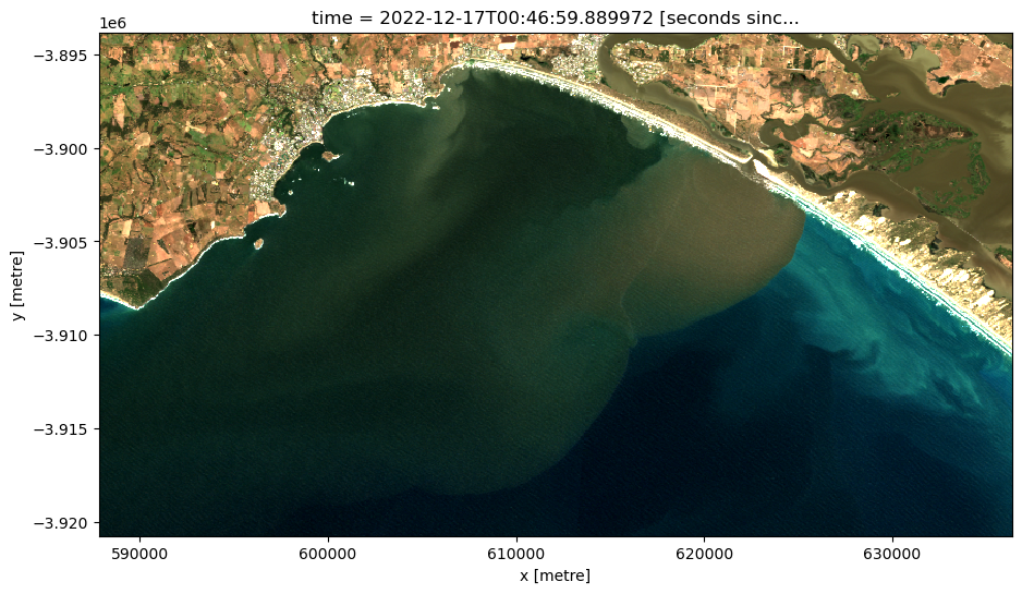
To visualise the data, use the pre-loaded rgb utility function to plot a true colour image for a given time-step.
Change the value for timestep to explore the data.
[7]:
# Set the timestep to visualise
timestep = 20
# Generate RGB plot at the desired timestep
rgb(ds,
index=timestep,
percentile_stretch=(0.05, 0.98))
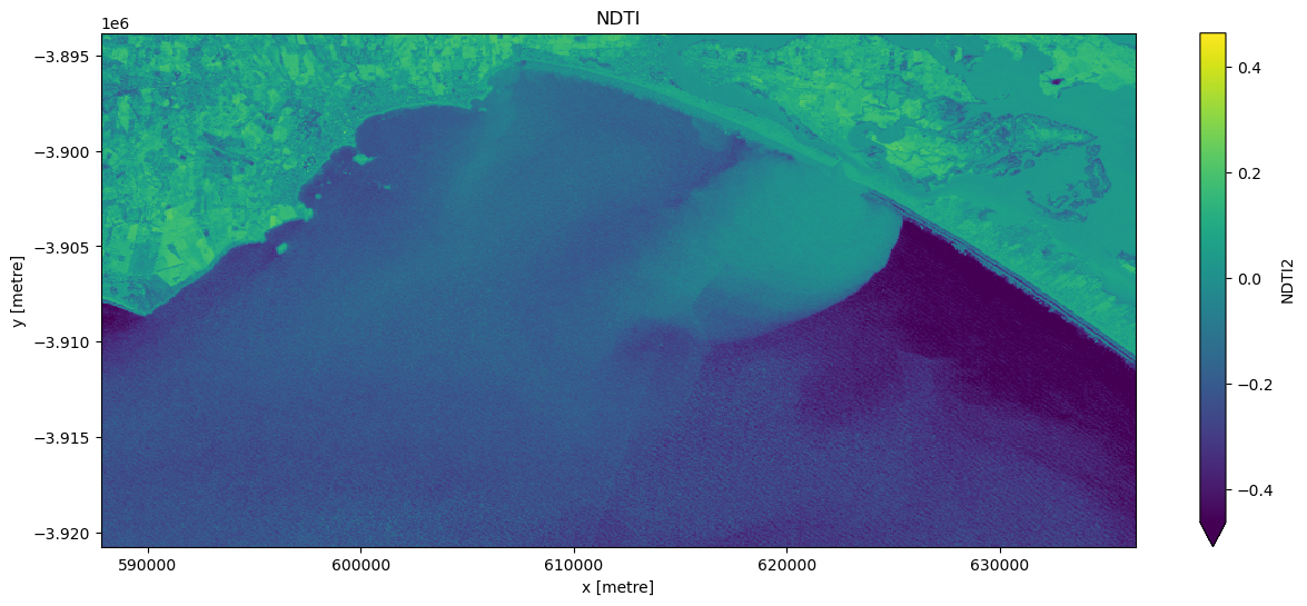
Calculate the NDTI index
First, calculate the NDTI index mentioned in the ‘Background’ section. Then visualise some imagery.
When it comes to interpreting the index, high values represent pixels with high turbidity, while low values represent pixels with low turbidity.
[8]:
# Calculate NDTI
ds = calculate_indices(ds, index="NDTI2", collection="ga_s2_3")
[9]:
# Visualise this
ts = ds["NDTI2"].isel(time=timestep)
ts.plot.imshow(robust=True, cmap="viridis", figsize=(15, 6))
plt.title("NDTI");
Compute Normalised Difference Water Index
When we applied the turbidity index to the imagery, the presence of land pixels within the imagery results in extremely high turbidity values over land thus reducing the sensitivity of the rasters contrast stretch over water. Hence we can mask out pixels associated with land to enhance the colour stretch over aquatic areas.
To do this, we can use our Sentinel-2 data to calculate a water index called the ‘Normalised Difference Water Index’, or NDWI. This index uses the ratio of green and near-infrared radiation to identify the presence of water. The formula is as follows:
When it comes to interpreting the index, high values (greater than 0) typically represent water pixels, while low values (less than 0) represent land. You can use the cell below to calculate and plot one of the images after calculating the index.
[10]:
# Calculate the water index
ds = calculate_indices(ds, index="NDWI", collection="ga_s2_3")
Plot a representative sub-sample of time steps with a variety of environmental factors (e.g extreme turbidity, low turbidity, cloud, wave break).
[11]:
# Plot a representative subset of the dataset (ds)
ds["NDWI"].isel(time=[1, 7, 20, 26]).plot.imshow(
vmin=-1, vmax=1, cmap="RdBu", col="time", col_wrap=2, figsize=(12, 6)
)
[11]:
<xarray.plot.facetgrid.FacetGrid at 0x7f1ea18b1310>
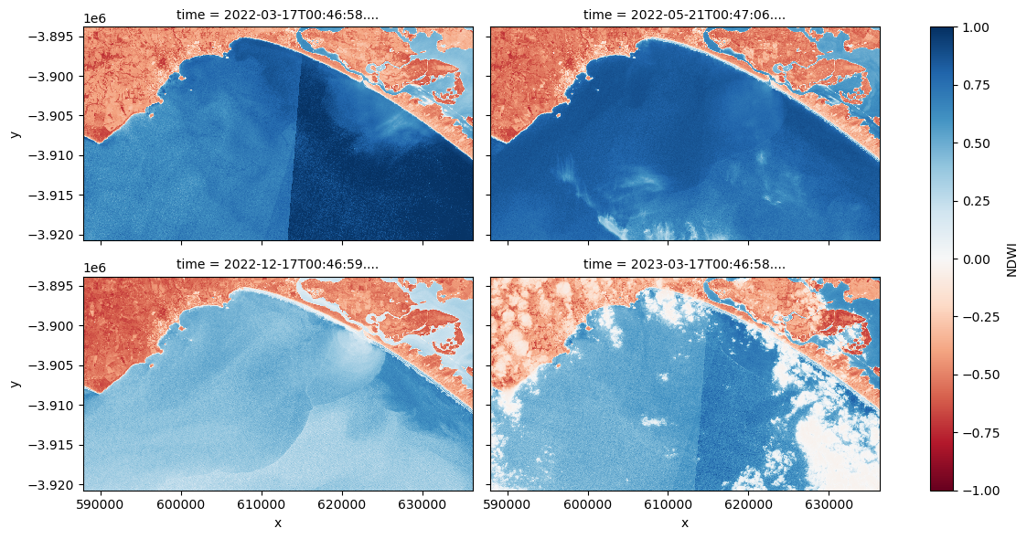
Question How does extremely turbid water, wave break, and cloud impact upon NDWI values?
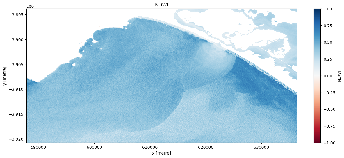
Mask out the land
Experiment with a landmask_threshold to isolate just water body pixels and visualise the results.
[12]:
# Trial land masking thresholds
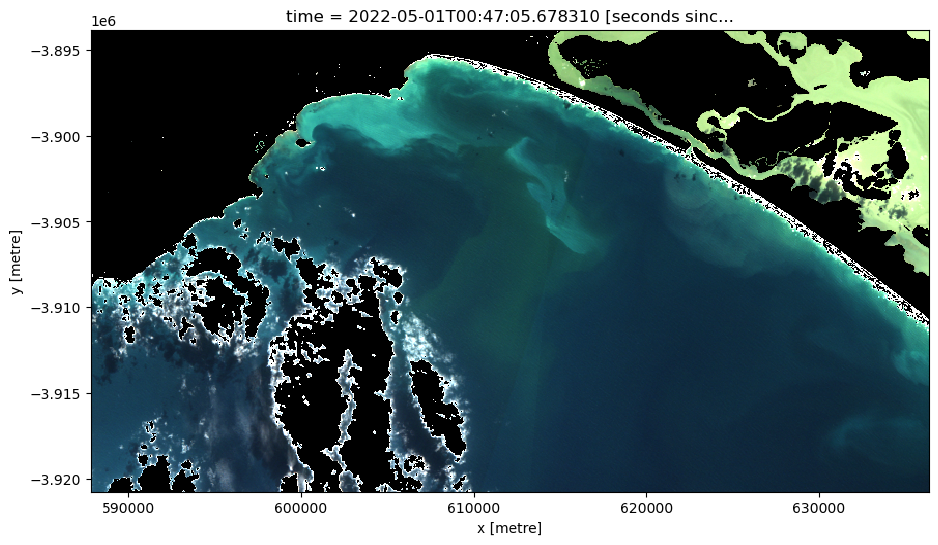
landmask_threshold = -0.05
dslmask_trial = ds["NDWI"].isel(time=20).where(ds["NDWI"] > landmask_threshold)
[13]:
# Visualise this
ts = dslmask_trial.isel(time=timestep)
ts.plot.imshow(vmin=-1, vmax=1, cmap="RdBu", figsize=(15, 6))
plt.title("NDWI");
Once an appropriate threshold has been established create a new dataset titled ‘ds_lmask’.
[14]:
# Mask the dataset
ds_lmask = ds.where(ds['NDWI'] > landmask_threshold)
Cloud masking with s2cloudless
When working with Sentinel-2 data, users can apply a Sentinel-2 specific cloudmask, s2cloudless, a machine learning cloud mask developed by Sinergise’s Sentinel-Hub.
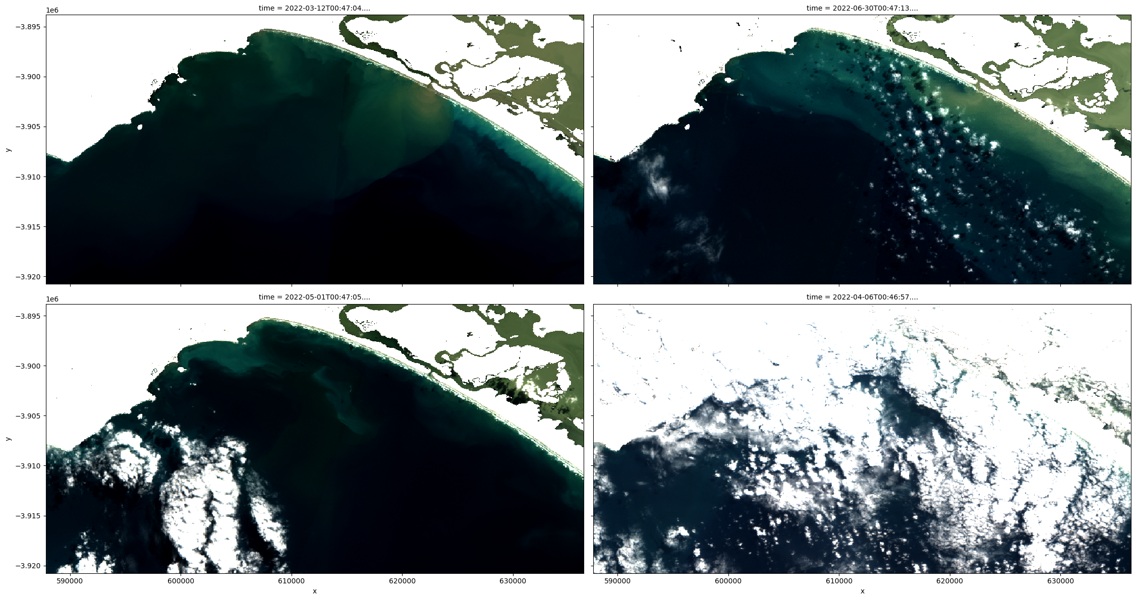
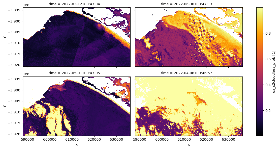
We can also easily load and inspect s2cloudless’s cloud probability layer that gives the likelihood of a pixel containing cloud. To do this first decide on a representative sample of the dataset ranging from non-cloud affected to very cloud affected imagery. Then plot the s2cloudless band on the same sample and decide on a making threshold to be applied to the dataset ds_lmask, which will then be renamed to ds_clmask (‘c’ stands for cloud, and ‘l’ stands for land).
[15]:
# Plot a representative sample of ds_lmask rgb
rgb(ds_lmask, index=[0, 9, 5, 3], percentile_stretch=(0.2, 0.85), col_wrap=2)
/env/lib/python3.8/site-packages/matplotlib/cm.py:478: RuntimeWarning: invalid value encountered in cast
xx = (xx * 255).astype(np.uint8)
[16]:
# Plot the same sample of ds_lmask, cloud probability
ds_lmask["oa_s2cloudless_prob"].isel(time=[0, 9, 5, 3]).plot.imshow(
cmap="inferno", col="time", col_wrap=2, figsize=(12, 6)
)
[16]:
<xarray.plot.facetgrid.FacetGrid at 0x7f1f0a1dcca0>
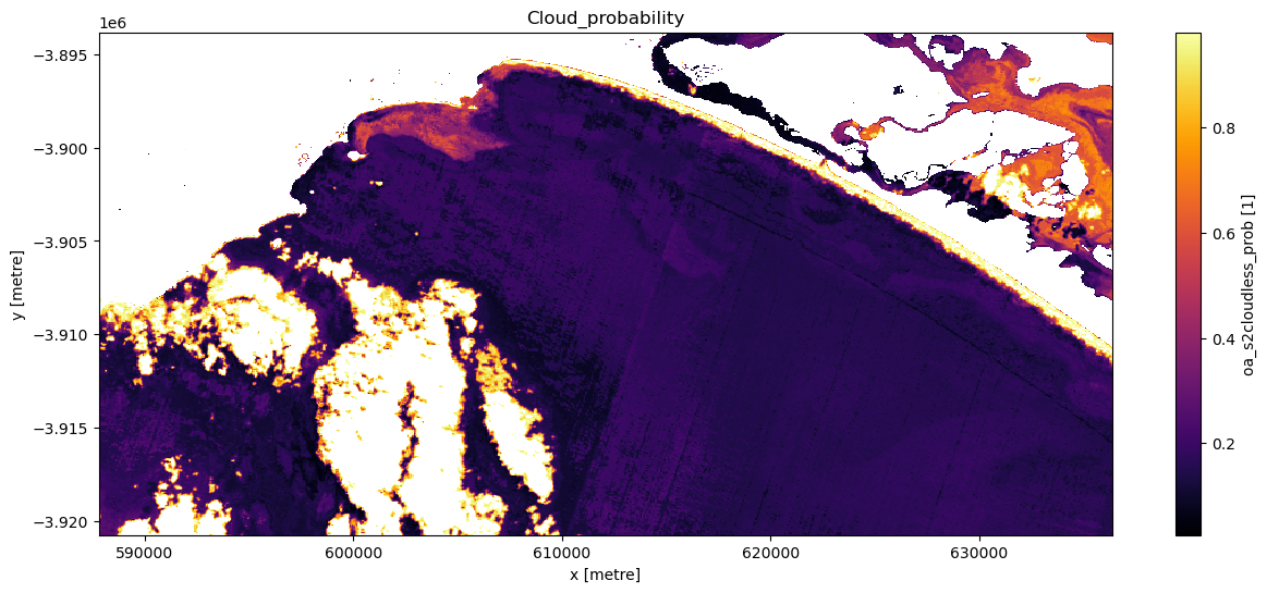
Experiment with the cloud mask. Change the cloudmask threshold and see how it affects the imagery, examine multiple timesteps. It is not imperative you remove every single cloud affected pixel: if you did so you would likely also be masking out highly turbid pixels.
[17]:
# Set cloudmask threshold
cloudmask_threshold = 0.98
# Set the timestep to visualise
timestep = 5
# Apply 'cloudmask_mask' to trial dataset 'ds_clmask_trial'
ds_clmask_trial = ds_lmask["oa_s2cloudless_prob"].where(
ds["oa_s2cloudless_prob"] < cloudmask_threshold
)
# Visualise this
ts = ds_clmask_trial.isel(time=timestep)
ts.plot.imshow(cmap="inferno", figsize=(15, 6))
plt.title("Cloud_probability");
Now an appropriate threshold has been established create a new dataset titled ds_clmask.
[18]:
# Once certain cloudmask the dataset
ds_clmask = ds_lmask.where(ds["oa_s2cloudless_prob"] < cloudmask_threshold)
Visualise and interrogate the imagery
At this point we will plot all the masked data both in RGB and NDTI.
As both land and cloud have been masked, these values are now ‘null’ values. This is problematic as null values appear white, which is the same colour as clouds; this can be a source of confusion when displaying in RGB. To rectify this set ‘null’ values to ‘0’.
[19]:
# Manually set the null values equal to zero so they don't appear white like clouds
ds_clmask_zero = ds_clmask.where(~ds_clmask.isnull(), 0)
[20]:
# Generate RGB plot at the desired timestep
rgb(ds_clmask_zero,
index=timestep,
percentile_stretch=(0.1, 0.975))
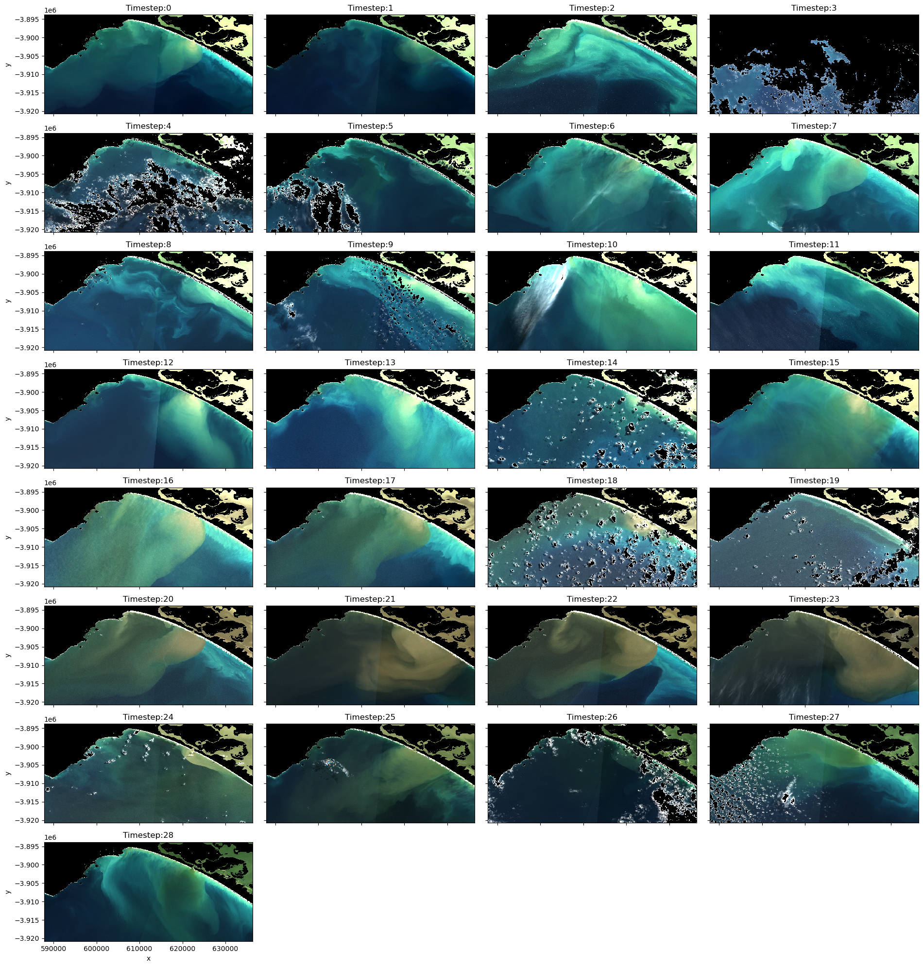
Now plot all the imagery in RGB and NDTI.
Consider which images you want in your final animations. If an image remains too cloud affected or there is severe seamline effects (boundaries between adjacent image tiles, as observed in timesteps 0 and 1), it might be worth removing these images. Make a note of all the images you want to retain in the variable below called timesteps.
[21]:
# Plot the data so you can determine if there are any images you don't want in your animated time series
# Create a list of titles for the series of images and their timesteps
titles = list(f'Timestep:{x}' for x in range(0, len(ds_clmask_zero.time)))
# Plot the image series with titles
rgb(ds_clmask_zero, col="time", col_wrap=4, percentile_stretch=(0.1, 0.975), titles=titles, size=2.5)
[22]:
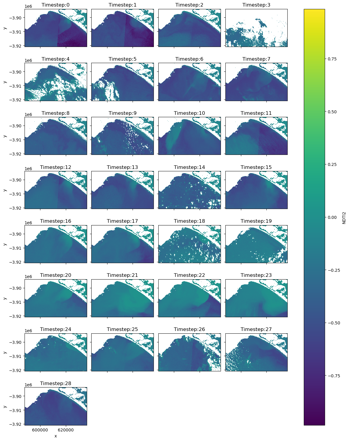
# Plot the NDTI data with the mask so you can determine if there are any images you don't want in your animated time series
img = ds_clmask["NDTI2"].plot(col="time", col_wrap=4, cmap="viridis", figsize=(12, 15))
# Add timesteps to the plot titles
for ax, title in zip(img.axs.flat, titles):
ax.set_title(title)
In the next two cells create two datasets for two separate purposes. ‘ds_final_imgs’ will be utilised to create animations of 1) the NDTI over only waterbodies, and 2) an RGB animation with the land and cloud masked to increase the contrast stretch over the waterbodies. Create another dataset ds_final_images_no_mask without the final mask to display the mosaicked imagery simply in RGB in their original state.
[23]:
# List the imagery timesteps to be included in the animations
timesteps = [2, 5, 6, 7, 8, 9, 13, 14, 15, 16, 17, 18, 19, 20, 21, 22, 23, 24, 25, 28]
[24]:
# Create a dataset with only the desired time steps to be utilised in an animation when a cloud and land mask is needed.
ds_final_imgs = ds_clmask.isel(time=timesteps)
[25]:
# Create a dataset with only the desired time steps to be utilised in an animation when no mask is needed.
ds_final_imgs_no_mask = ds.isel(time=timesteps)
Print both datasets familiarise yourself with the data and ensure the timesteps are equal for both datasets.
[26]:
# Check that the timesteps are equal for both datasets
ds_final_imgs_no_mask.time.values == ds_final_imgs.time.values
[26]:
array([ True, True, True, True, True, True, True, True, True,
True, True, True, True, True, True, True, True, True,
True, True])
[27]:
# Print and investigate the index of each time step in ds_final_imgs
for i, time in enumerate(ds_final_imgs.time.values):
print(f"Time step {i}: {time}")
Time step 0: 2022-04-01T00:47:02.723150000
Time step 1: 2022-05-01T00:47:05.678310000
Time step 2: 2022-05-11T00:47:04.242350000
Time step 3: 2022-05-21T00:47:06.941348000
Time step 4: 2022-06-25T00:47:05.431567000
Time step 5: 2022-06-30T00:47:13.488838000
Time step 6: 2022-09-13T00:47:02.636509000
Time step 7: 2022-10-08T00:47:07.032473000
Time step 8: 2022-11-07T00:47:04.627755000
Time step 9: 2022-11-17T00:47:02.549405000
Time step 10: 2022-12-02T00:46:58.683008000
Time step 11: 2022-12-07T00:47:01.111954000
Time step 12: 2022-12-12T00:46:57.822074000
Time step 13: 2022-12-17T00:46:59.889972000
Time step 14: 2023-01-01T00:46:59.408833000
Time step 15: 2023-01-06T00:46:59.476344000
Time step 16: 2023-01-11T00:46:56.637909000
Time step 17: 2023-02-10T00:46:59.060952000
Time step 18: 2023-02-20T00:46:59.702085000
Time step 19: 2023-05-11T00:47:03.027042000
Produce the animations
Create animations with xr_animation for:
1. RGB unmasked imagery
2. RGB land and cloud masked, and contrast stretched
3. NDTI land and cloud masked imagery
Consider changing the following parameters:
show_textwill adapt the text of the labelintervalwill alter the amount at which images are displayed (units = milliseconds)width_pixelschanges the size of the displayannotation_kwargsto change the typography of the label
[28]:
# Produce time series animation of RGB (unmasked)
xr_animation(ds=ds_final_imgs_no_mask,
bands=['nbart_red', 'nbart_green', 'nbart_blue'],
output_path='RGB_Murray_Mouth_Plume.mp4',
annotation_kwargs={'fontsize': 20, 'color':'white'},
show_text='RGB',
interval=2000,
width_pixels=800)
# Plot animation
plt.close()
Video('RGB_Murray_Mouth_Plume.mp4', embed=True)
Exporting animation to RGB_Murray_Mouth_Plume.mp4
[28]:
[29]:
# Produce time series animation of RGB with land and cloud masked and contrast stretched.
xr_animation(ds=ds_final_imgs,
bands=['nbart_red', 'nbart_green', 'nbart_blue'],
percentile_stretch=(0.1, 0.975),
output_path='RGB_Land_Masked_Murray_Mouth_Plume.mp4',
show_text='RGB contrast stretched - Land Masked',
annotation_kwargs={'fontsize': 20},
interval=2000,
width_pixels=800)
# Plot animation
plt.close()
Video('RGB_Land_Masked_Murray_Mouth_Plume.mp4', embed=True)
Exporting animation to RGB_Land_Masked_Murray_Mouth_Plume.mp4
/env/lib/python3.8/site-packages/matplotlib/cm.py:478: RuntimeWarning: invalid value encountered in cast
xx = (xx * 255).astype(np.uint8)
[29]:
[30]:
# Produce time series animation of NDTI land and cloud masked.
xr_animation(ds=ds_final_imgs,
output_path='NDTI_Murray_Mouth_Plume.mp4',
bands='NDTI2',
show_text='NDTI - Land Masked',
interval=2000,
width_pixels=800,
annotation_kwargs={'fontsize': 20, 'color':'black'},
imshow_kwargs={'cmap': 'viridis', 'vmin': -0.5, 'vmax': 0.0})
# Plot animation
plt.close()
Video('NDTI_Murray_Mouth_Plume.mp4', embed=True)
Exporting animation to NDTI_Murray_Mouth_Plume.mp4
[30]:
Drawing conclusions
Here are some questions to think about:
What can you conclude about the magnitude and timing of the Murray River flood discharge?
Which portions of the coast were most affected by this event?
What are some of the limitations of this method of assessing river-plume turbidity?
Next steps
When you are done, return to the “Set up analysis” and “Load Sentinel-2 data” cells, modify some values (e.g. time, lat_range/lon_range) and rerun the analysis.
If you change the location, you’ll need to make sure Sentinel-2 data is available for the new location, which you can check at the DEA Explorer (use the drop-down menu to view all Sentinel-2 products).
Additional information
Author: This notebook was developed by Joram Downes (Flinders University).
License: The code in this notebook is licensed under the Apache License, Version 2.0. Digital Earth Australia data is licensed under the Creative Commons by Attribution 4.0 license.
Contact: If you need assistance, please post a question on the Open Data Cube Slack channel or on the GIS Stack Exchange using the open-data-cube tag (you can view previously asked questions here). If you would like to report an issue with this notebook, you can file one on
GitHub.
Last modified: June 2023
Compatible datacube version:
[31]:
print(datacube.__version__)
1.8.13
Tags
Tags: sandbox compatible, sentinel 2, load_ard, calculate_indices, display_map, rgb, NDWI, NDTI, turbidity, real world, flooding